Easy Figma Guide for Engineers
■Episode 3: Groups, Frames, and Components
(Last updated: 2023.07.27)
Figma illustration
You can read this article in 5 minutes!
(If the images are small, rotate your phone horizontally)
"I want to work efficiently!"
If you create your design impulsively without a plan, it tends to lack consistency and become inefficient.
As mentioned in the previous episode about color and text styles, it’s better to save frequently used elements as reusable parts.
In this episode, we’ll explain the design building blocks: Groups, Frames, and Components.
[Table of Contents]
Showing the Layout Grid
Grouping
Framing
Componentization
Summary
1. Showing the Layout Grid
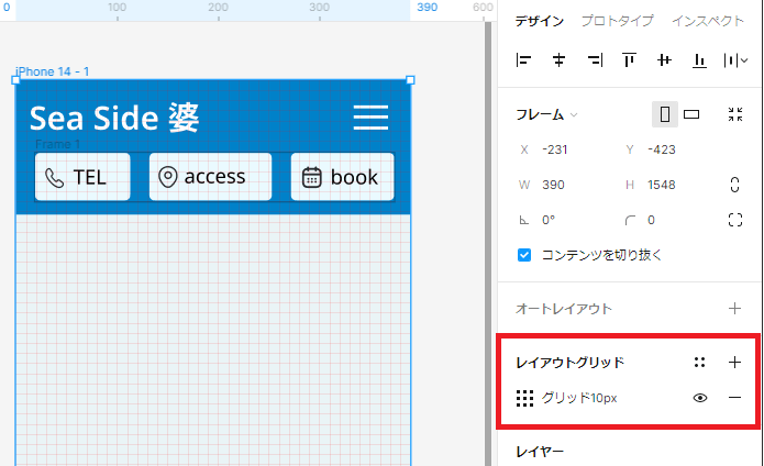
Let’s dive into the real design work. But first, a bit of preparation.
With the current editing screen, it’s hard to align elements precisely. So we need to enable the grid lines.
Select the iPhone 14 frame, then click the "+" button under Layout Grid. You’ll see a mesh of grid lines appear.
You can change the spacing, but for now, the default 10px is fine.
With this, positioning elements should become much easier.
Layout Grid Display
2. Grouping
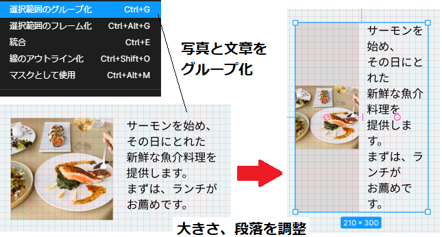
Grouping in Figma is quite similar to grouping in PowerPoint.
You can select multiple items with your mouse, right-click, and choose "Group".
For example, if you group an image and text, resizing the group will cause both the image and the text to scale accordingly.
However, you cannot set a background color on a group.
Grouping adjusts the content size together
3. Framing
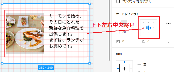
Framing works almost the same way as grouping.
Select multiple elements and right-click to choose "Frame".
The key features of a frame are: you can add a background color, and the content inside does not resize with the frame by default (though you can change this in settings).
Frames also support auto layout, which lets you control the alignment of inner elements—like centering them vertically and horizontally, or anchoring them to the top right or bottom left, with adjustable margins.
If you want to maintain the content size while adding padding, frames are ideal.
Create font frames and register text styles
4. Componentization
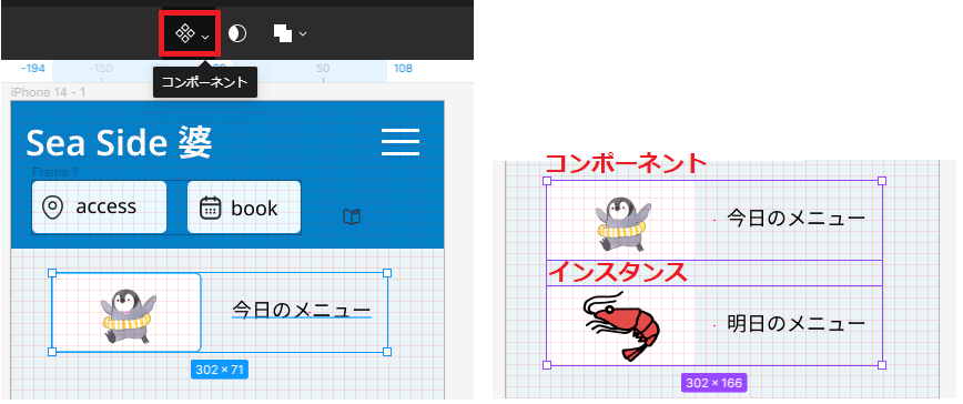
Components are, simply put, templates. You can define reusable parts as components.
To create one, select the parts you want to include and click the component button at the top.
In the example below, the image of a penguin, the text "Today’s Menu", and a background color are made into a component.
The best part about components is that you can create instances (copies) of them.
On the right in the image, we’ve created an instance with the image replaced by a shrimp and the text changed to "Tomorrow’s Menu".
The benefit of instances is that you can change the contents while keeping the overall format.
If you later change the background color of the original component to green, the instance with the shrimp will also have a green background.
This makes it easy to update designs uniformly.
Component (left) and its instance with a modified image (right)
5. Summary
In this episode, we covered grouping, framing, and componentization in Figma.
Especially the last one—components—play an essential role in maintaining design consistency, just like color and text styles introduced in the previous article.
Start with simple ones and make components a part of your workflow.
▼References
Official Figma Website – figma.com
Complete Beginner Guide to Figma [2022 Edition] – U Channel (YouTube)
Learn Figma Leisurely – Components – SAKURA internet