エンジニアにも使いやすいFigma入門
■第4話:コンポーネントのバリアント、プロパティ
(最終更新日:2023.07.27)

(絵が小さい場合はスマホを横に)
「一部変更して使いたい」
ボタンのアイコン部分を変えるだけ、文字を変えるだけという具合に、
元のデザインはそのまま、デザインを一部変更して別のサイトに使いたいということは結構あるはずだ。
それに加えて、ボタンを押したときの動作、選択されているときの色や文字を変えたいといった、要望もある。
これらを実現してくれる機能がバリアントとプロパティである。
今回は、そんなFigmaのコンポーネントのバリアントとプロパティについて説明する。
1.コンポーネントのバリアント
バリアントとは、hover(マウスをオブジェクトの上に置く)やclickなどを取り扱うもので、 同じボタンでも少し異なったものを保存するための機能である。 バリアントを作成するのは簡単だ。作成したいコンポーネントを選択し、 プロパティの+を押したら、バリアントを選択する。 すると、紫の枠と+ボタンが出現するので、変化させたい数だけ+ボタンを押す。
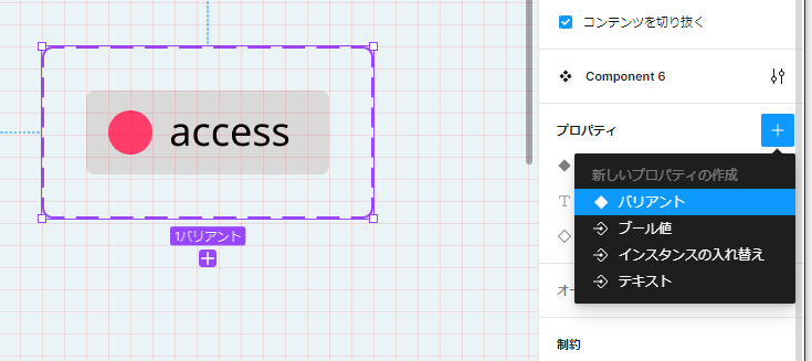
バリアントの作成(プロパティでバリアントを選択)
バリアントを作成したら、各々のインスタンスに対して明るさや色を変化させて、違いをつける。 変化はFigma右側のデザインのタブで簡単に変更できる。 下記の場合、作成した三つのバリアント(左)に対して、右上が通常時(変化なし)、 右の真ん中がhoverに、右下がdisabledに相当するように変化をつけた。
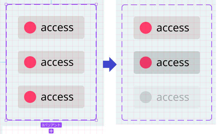
hover(真ん中)、disabled(下)の作成
これらを実装すると、以下のように簡単にインスタンス状で3つの状態の違いを変えることができる。 以下の動画では、更にプロパティとして、アイコンを2つ登録し、それぞれを入れ替えている。 ボタンの種類を余計に作らず、スッキリまとめられることが分かるだろう。
ボタンの3つの状態とアイコンの変更
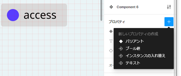
2.コンポーネントのプロパティ
上記ではバリアントに加え、アイコンの入れ替えを簡単に説明した。 アイコンの違いだけでなく、プロパティは他にも設定を変えられる。 設定項目としては、先ほどのバリアント、インスタンスの入れ替え(上記のアイコンの入れ替え)に加えて、 テキストの変更とブール値が設定できる。
プロパティの設定項目
テキストの変更は、上記の「access」の部分を「test」など違う文字に入れ替えられる(下記動画)。 これにより、テキスト毎にデザイン変えて保存しなくて良い。 また、下記の動画には示していないが、ブール値の設定では、画像の有無をスイッチ一つで切り替えられるようになる。 イメージは簡単に沸くだろう。
プロパティのテキストの変更
3.まとめ
今回はFigmaのコンポーネント、バリアントとプロパティについて説明した。 アイコンや文字をプロパティに指定すれば、簡単に見た目を切り替えられる。 また、バリアント機能を使えば、動作に関する部分もシミュレーションできる。 Figmaをより便利に使いこなすにあたり、ぜひ、これらの機能はマスターしておこう。
▼参考図書、サイト
のんびり学ぶ Figma 〜コンポーネント編〜(2) SAKURA internet
Figmaのコンポーネントプロパティ入門 ICS MEDIA