Web制作、Web開発の歩き方

初心者のためのDjango入門

■第19話:Pandasデータの可視化と実用的な使い方

(最終更新日:2023.06.24)

Djangoフレームワークのイメージ
この記事は6分で読めます!
(絵が小さい場合はスマホを横に)

「Pandasデータを可視化しよう!」

Pandasでまとめたデータを活かすには、グラフにして可視化することが不可欠である。 実際excelなどの表計算ソフトでも、作成したデータに対して様々な形でグラフ化して、分析を行う。 今回はpandasで作成したDataFrameに対して、matplotlibというPythonライブラリを用いることでグラフ化する。 データサイエンスの入門ツールとして、ぜひ学んでみてほしい。


1.データの可視化

本項では、PandasのDataFrameをグラフ化するには、MatplotlibやSeabornなどのライブラリを使用する方法が挙げられる。 今回はMatplotlibを用いて、グラフ化する方法について説明する。 まずは、Pandasで年齢、職業、収入に関するとデータフレームを作成する。 以下のとおり、データフレームが作成できた。
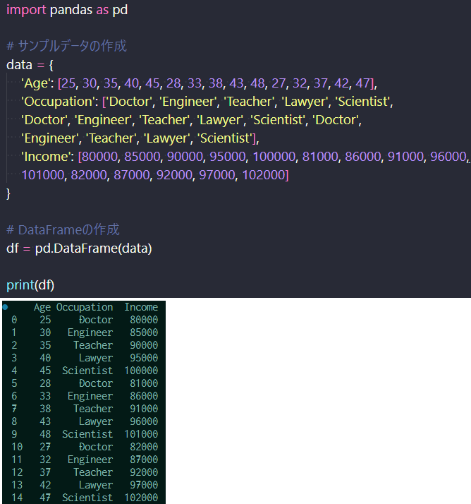
データフレームの作成

データフレームの作成

これに対して、グラフ化を行う。まずは、各職業の平均収入を棒グラフにしてみた。 平均に関してはpandasで先に計算する。職業別に収入の項目を平均化するには以下の4行目にあるように書く。 そして、平均化したデータを、matplotで棒グラフにする。棒グラフの作り方はkind=barを選択する。 plt.show()を実行すれば、下記のように作成したグラフが生成される。

これだけ見ると、サイエンティストの年収が高いように思える。
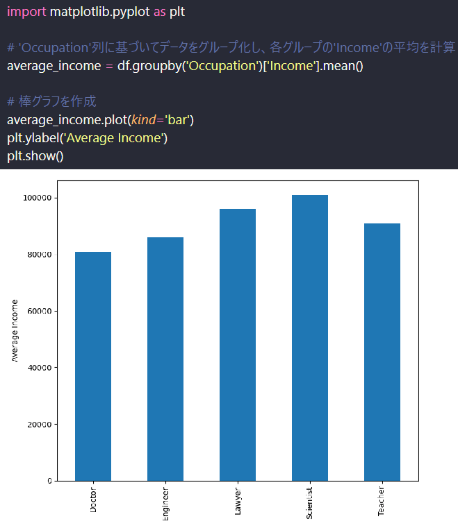
職業別年収の棒グラフ

職業別年収の棒グラフ(平均)

次に年齢別に散布図を作成する。横軸に年齢、縦軸に年収をとり、プロットする。 散布図はkind=scatterと書く。あとはx='Age'で横軸年齢、y='Income'で縦軸年収としている。 先ほどと同様、plt.show()を実行すれば、下記のように作成したグラフが生成される。

この図を見ると、年齢と年収に強い正の相関があることが分かる。 つまり、職業よりも年齢が高いほど年収が上がるということが、このグラフから分かった。

Matplotlibの散布図

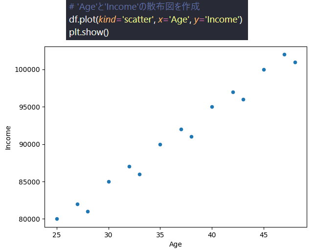
Matplotlibの散布図(年齢 vs 年収)

このように、色んなグラフを持って多面的にデータを分析できると 「年齢と年収には強い相関があるのでは?」といった仮説を検証する精度が非常に高くなる。 データサイエンスとして非常に重要なアプローチである。 しかも、Pythonであれば、プログラムを走らせるだけでデータ抽出、データ加工、グラフ化まで自動化できるので、極めて効率的である。

2.実用的なPandasの使い方

実用的なPandasの使い方には「データのクリーニング」「データ変換」「データの集約」「時間系列データの処理」「Pivotテーブルの作成」「クロス集計」 などがある。今回は「Pivotテーブルの作成」と「クロス集計」について説明する。

Pivotテーブルの作成はpivot関数を用いて行う。縦軸に「日付」、横軸に「都市」、 ピボットさせたいデータに「気温」と「湿度」があるとすると、まず下記のようにデータフレームを作成し、 pivot関数を使うことで作成することができる。このように、温度と湿度(もしくは、Los AngelsとNew York)のように、 パラメータや要素がpivotする場合には、pivotテーブルを用いることで一つのテーブルに集約して表示することができる。 (ちなみに下記の気温は℉とする)

ピボットテーブル

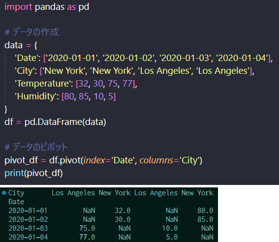
ピボットテーブルのコード(上)と結果(下)

クロス集計は、crosstab関数を用いて行う。 下記のようにデータフレームを作成し、crosstab関数を用いることでクロス集計を行うことができる。 下記の場合、A、B二つのデータ項目に各々morning,nightとicd, beerが格納されている。 それぞれのデータがいくつあるかを集計した結果が以下の通りとなる。 朝にiceを買う人が多く、夜にビールを買う人が多いことを示している。 この事自体は普通だが、2要素の関係性を示すことに威力を発揮する。

マーケティングの世界では有名な話だが、ビールを買う人は紙おむつも一緒に購入するという現象がある。 このような、一見何故か分からない関係性を示したのもこのような集計、分析のおかげである。 統計分析ツールとして使えるようにしておこう。
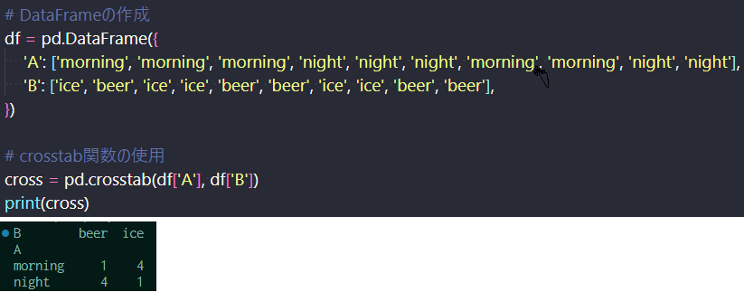
クロス集計

クロス集計のコード(上)と結果(下)

3.まとめ

今回、Pandasデータの可視化と実践的な応用例について説明した。 データの可視化に関しては、散布図にするだけで比例のような相関が見られたり、 ある値以上で、頭打ちになっているというデータの傾向を明らかにできる。 頭の中で考えた仮説を、データを持って検証できる非常に強力なツールだ。 是非、Pythonで自動化して、様々なデータを分析してみよう。きっと新たな発見があるはずだ。

一方、ピボットテーブルやクロス集計では、異なる2要素の関係性を数字で見ることができた。 ECサイトでビールと一緒に紙おむつを買う、何かのついでに何かを買う関係性があれば、適切なレコメンドができ、 売上を向上させることができるはずだ。

プログラミングの知識にとどまらず、その先の統計分析、マーケティングまで少し足を伸ばして貰えればと思う。


▼参考図書、サイト

Matplotlib入門 | Pythonを使ってデータを可視化してみよう!  AI Academy Media
pandasでstack, unstack, pivotを使ってデータを整形  note.nkmk.me


Django Tutorial for Beginners ■Episode 19: Visualizing Pandas Data and Practical Usage (Last updated: 2023.06.24) Image of Django Framework This article takes 6 minutes to read! (Rotate your phone horizontally if the image appears too small) "Let's visualize Pandas data!" To fully utilize data summarized with Pandas, visualizing it with graphs is essential. Just like spreadsheet software such as Excel, graphing the data is a key part of analysis. In this episode, we’ll use the Python library Matplotlib to visualize a DataFrame created with Pandas. This is a must-learn entry-level tool for data science. [Table of Contents] Data Visualization Practical Usage of Pandas Summary 1. Data Visualization In this section, we’ll discuss how to visualize a Pandas DataFrame using libraries like Matplotlib and Seaborn. Here, we'll use Matplotlib. First, we create a DataFrame with age, occupation, and income data. As shown below, the DataFrame is created. Create a DataFrame Created DataFrame Now let’s graph it. We start with a bar chart of average income by occupation. The average is calculated with Pandas first, as shown in line 4. Then, we use `kind='bar'` in Matplotlib to create the chart. By running `plt.show()`, the graph will be displayed as shown below. From this chart, it appears that scientists have the highest income. Bar chart of income by occupation Bar chart of average income by occupation Next, we create a scatter plot showing age versus income. The x-axis is age, and the y-axis is income. Use `kind='scatter'`, and specify `x='Age'`, `y='Income'`. Again, running `plt.show()` displays the graph. The chart shows a strong positive correlation between age and income. In other words, income tends to rise with age more than by job type. Matplotlib scatter plot Matplotlib scatter plot (Age vs Income) Using different types of charts enables multi-faceted analysis. You can test hypotheses like “Does income rise with age?” with much higher accuracy. This is a crucial data science approach. Python also makes the process highly efficient—data extraction, processing, and visualization can all be automated. 2. Practical Usage of Pandas Practical Pandas techniques include data cleaning, data transformation, aggregation, time series processing, pivot tables, and cross-tabulation. Here, we focus on creating pivot tables and performing cross-tabulation. Pivot tables are created using the `pivot()` function. Suppose the vertical axis is "Date", horizontal axis is "City", and we want to pivot "Temperature" and "Humidity". We first create a DataFrame, then use `pivot()` to create the table. This allows values like temperature and humidity (or Los Angeles and New York) to be combined into a single table. (Temperatures below are in Fahrenheit.) Pivot table Pivot table code (top) and result (bottom) Cross-tabulation is done using the `crosstab()` function. We create a DataFrame and use `crosstab()` to analyze how many entries exist per combination of two categories. In this case, we analyze combinations like morning/night and ice/beer. The results show that people buy more ice in the morning and more beer at night. This may sound obvious, but this kind of analysis is powerful for uncovering relationships between variables. For example, a well-known marketing insight is that people who buy beer often also buy diapers. This kind of unexpected relationship is revealed through such analysis. Cross tabulation Cross-tabulation code (top) and result (bottom) 3. Summary In this episode, we explained how to visualize Pandas data and gave practical usage examples. With visualization, even a simple scatter plot can reveal proportional or plateau relationships in data. It’s a powerful tool that allows you to test hypotheses with real data. Try automating your analysis in Python—you may uncover new insights! Meanwhile, with pivot tables and cross-tabulation, we explored relationships between two different elements. For example, recommending diapers to people who buy beer could boost e-commerce sales. We hope you’ll go beyond programming and step into the world of statistical analysis and marketing. ▼References   Introduction to Matplotlib | Visualizing Data with Python – AI Academy Media   Formatting Data with stack, unstack, and pivot in pandas – note.nkmk.me